Case study.
New Zealand Film Commission,
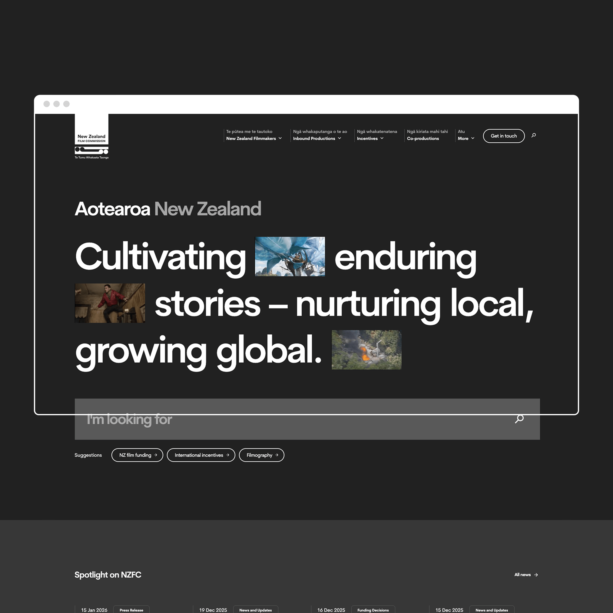
Website Design.
Reimagining a national cultural platform for both local filmmakers and the global screen industry.
UX & Design System
2024/25
nzfilm.co.nzThe New Zealand Film Commission (NZFC) sits at the intersection of culture, industry and international investment. Its website needs to serve two very different audiences.
Local filmmakers and industry professionals looking for funding, guidance and support.
International studios and producers assessing whether New Zealand is the right place to bring major productions.
The existing site struggled to do either well. Information was fragmented, navigation unclear and critical content hidden behind PDFs and internal language. The result was friction, confusion and missed opportunity ... both locally and globally.
The challenge
- Local users needing clarity, detail and process-driven information
- International users needing confidence, reassurance and a compelling story
- Highly complex funding structures and eligibility criteria
- Content-heavy pages with poor discoverability
- Strong internal stakeholder views shaped by legacy structures
The challenge was not choosing one audience over the other, but to design a system that respected both without compromise.
My role
As UX Director at Dave Clark, I led the UX and content strategy for the NZFC website redesign.
- Defining the experience strategy and audience segmentation
- Leading the information architecture and navigation model
- Shaping the content structure and page frameworks
- Balancing stakeholder needs with real user behaviour
- Ensuring accessibility and usability were embedded throughout
This was a deeply collaborative project, but one that required strong UX leadership to keep the experience coherent.
Strategy & approach
Clarity through structure.
The core strategy was to stop treating the site as a single experience and instead acknowledge the reality: different users arrive with different intent...
- Clear segmentation between local and international pathways
- Task-based navigation rather than organisational structure
- Bringing critical information out of PDFs and into the page
- Designing pages to be read, scanned and understood, not just archived
We focused heavily on reducing cognitive load and making complex information feel manageable without oversimplifying it.
Information Architecture & Content Design
Funding programmes, incentives and co-production agreements are inherently complex. The problem wasn’t the content, but how it was to be presented.
- I reworked funding information into structured, scannable formats
- Introduced clearer categorisation and filtering
- Standardised page templates so users could learn the system once
- Designed content hierarchies that supported both deep reading and quick answers
The result was a site that supported exploration without overwhelming users.
Design System & Patterns
Alongside the IA and content work, I developed a design system and page framework that...
- Supported a wide range of content types
- Maintained consistency without visual repetition
- Allowed flexibility for future growth
- Met accessibility standards across all page types
The system ensured that whether users were reading about funding, locations, or incentives, the experience felt coherent and intentional.
Collaboration & Stakeholders
NZFC has deep internal expertise and strong views on how information should be presented. A key part of the role was helping stakeholders see the site through users’ eyes. This involved...
- Regular workshops and reviews
- Translating user research into clear design rationale
- Making trade-offs visible and understandable
- Building confidence that clarity does not equal oversimplification
Design became a shared language for decision-making.
Outcomes & Impact
A platform built for industry and growth...
- Made funding and incentives easier to understand and navigate
- Created clearer pathways for international productions
- Presented a more confident, cohesive picture of New Zealand’s screen industry
- Established a flexible foundation for future content and initiatives
The biggest win wasn’t just usability, but credibility.
What I Learned
This project reinforced how powerful information architecture and content design can be when done well. When structure is right, users don’t notice it, they just move forward with confidence.
Designing for multiple audiences isn’t about compromise. It’s about precision.
When information is complex, clarity becomes the product.
